Fitting a 1D population receptive field model to fMRI data from a numerosity experiment
Author: Malte Lüken (m.luken@esciencecenter.nl)
This examples shows how to fit a population receptive field (pRF) model to blood oxygenation level-dependent (BOLD) functional magnetic resonance imaging (fMRI) data.
A pRF model maps neural activity in a brain region of interest (ROI; e.g., V1 in the human visual cortex) to an experimental stimulus. Here, we use numerosity (e.g., the number of circles displayed on a screen) as an example, where the pRF defines a distribution in numerosity space that stimulates activity in the region of interest. Because the numerosity space is one-dimensional, the pRF model also has one dimension.
Because prfmodel uses Keras for model fitting, we need to make sure that a backend is installed before we begin. In this example, we use the TensorFlow backend.
import os
from importlib.util import find_spec

import pandas as pd

# Set keras backend to 'tensorflow' (this is normally the default)
os.environ["KERAS_BACKEND"] = "tensorflow"
# Print parameter DataFrames with three decimals
pd.set_option("display.precision", 3)

if find_spec("tensorflow") is None:
    msg = "Could not find the tensorflow package. Please install tensorflow with 'pip install .[tensorflow]'"
    raise ImportError(msg)
Loading the stimulus
In this example, we use a public dataset by Hendrikx et al. (2024) that is available on FigShare.
The numerosity stimulus that belongs to this dataset is already included in the package and can be loaded with prfmodel.examples.load_1d_prf_lognumerosity_stimulus(). It is also available as the stimulus attribute of the loaded dataset.
from prfmodel.examples import load_1d_prf_lognumerosity_stimulus

stimulus = load_1d_prf_lognumerosity_stimulus()
print(stimulus)
PRFStimulus(design=array[182, 8], grid=array[8, 1], dimension_labels=['log_numerosity'])
The stimulus design is a matrix with shape (num_frames, num_coordinates) that one-hot encodes which numerosity index is active at which time frame. The stimulus grid maps each numerosity index to its corresponding log numerosity value. There are eight unique numerosities. We can look at them on the natural scale.
import numpy as np

unique_log_numerosities = stimulus.grid.squeeze()
unique_numerosities = np.round(np.exp(unique_log_numerosities))

unique_numerosities
array([ 1., 2., 3., 4., 5., 6., 7., 20.])
We can also plot the stimulus design to see how numerosity changes over time.
import matplotlib.pyplot as plt

fig, ax = plt.subplots()

ax.imshow(stimulus.design.T, aspect=stimulus.design.shape[0] / stimulus.design.shape[1])
ax.set_xlabel("Time frame")
ax.set_ylabel("Numerosity (natural scale)")
ax.set_yticks(np.arange(len(unique_numerosities)))
ax.set_yticklabels(unique_numerosities)

secax = ax.secondary_yaxis("right")
secax.set_ylabel("Numerosity (log scale)")
secax.set_yticks(np.arange(len(unique_numerosities)))
secax.set_yticklabels(np.round(unique_log_numerosities, 2));
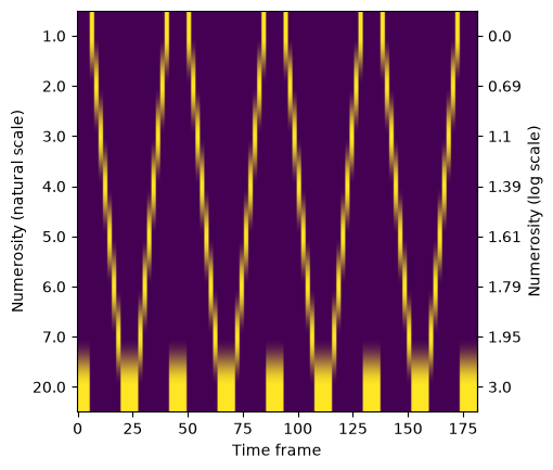
We can see that the design contains ascending and descending numerosity sequences from one to seven that are interleaved with sequences of the “baseline” numerosity 20. The ascend-descend cycle is repeated four times. Before the first cycle, there is a short baseline interval that was shown before the fMRI recording started (pre-scan interval). We will take both the cycles and the pre-scan interval into account when fitting the pRF model.
Loading the BOLD response
Now that we have the numerosity stimulus, we load the raw BOLD response data from a single subject. For simplicity, we only use the data from the left hemisphere. In the experiment, the subject was recorded for four runs, and we load the averaged neural time courses from the two even and the two odd runs. We will use the even and odd runs to do cross-validation.
from prfmodel.examples import load_dataset

# Downloads on first use and caches in a user data directory; the second call reuses the cache
dataset_odd = load_dataset("numerosity-timing", hemisphere="left", split="odd")
dataset_even = load_dataset("numerosity-timing", hemisphere="left", split="even")

response_raw_odd = dataset_odd.response
response_raw_even = dataset_even.response

response_raw_odd.shape, response_raw_even.shape
((5436, 176), (5436, 176))
Both the even and odd averaged responses have 176 time frames. When combined with the pre-scan interval of six time frames, this matches the 176 + 6 = 182 time frames of the stimulus.
Importantly, the response objects only contain time courses for vertices in ROIs that were shown to respond to the numerosity stimulus. Hence the small number of vertices. We can also load the indices of the ROI labels for the vertices.
roi_index = dataset_odd.roi_index
roi_index.shape
(5436,)
We can look at the unique ROI indices.
np.unique_counts(roi_index)
UniqueCountsResult(values=array([0, 1, 2, 3, 4, 5, 6, 7], dtype=int32), counts=array([995, 268, 653, 921, 963, 781, 287, 568]))
The mapping between ROI indices and labels comes with the dataset as well.
roi_mapping = dataset_odd.roi_mapping
roi_mapping
{0: 'NTO',
 1: 'NLO',
 2: 'NPO',
 3: 'NPCI',
 4: 'NPCM',
 5: 'NPCS',
 6: 'NFI',
 7: 'NFS'}
The ROI labels start with the letter “N” to indicate that they refer to a numerosity map. NTO, NLO, and NPO are occipital regions; NPCI, NPCM, and NPCS are regions around the central sulcus; NFI and NFS are located around the frontal sulcus (see Hendrikx et al., 2024, for details).
Before we inspect the data, we convert the responses from the raw signal into percent signal change (PSC).
def convert_psc(response_raw: np.ndarray) -> np.ndarray:
    """Convert raw neural responses into percent signal change."""
    return ((response_raw.T / response_raw.mean(axis=1)).T - 1.0) * 100.0


response_psc_odd = convert_psc(response_raw_odd)
response_psc_even = convert_psc(response_raw_even)
Inspecting the data
Before we model the BOLD response, we look at the timecourses and inspect the quality of the data. To do this we select a subset of vertices and plot their BOLD response over time. Note that the unit of time frames is repetition time (TR) which is 2.1 seconds for this dataset.
import plotly.io as pio
import plotly.express as px

pio.renderers.default = "notebook_connected"  # Requires internet connection to work
pio.templates.default = "simple_white"

fig = px.line(
    response_psc_odd[::50, :].T,
    animation_frame="variable",
    range_x=(0, 176),
    range_y=(-5, 5),
    labels={
        "index": "Time frame (in TR)",
        "value": "BOLD response (in PSC)",
        "variable": "Vertex",
    },
    title="Vertex time courses",
)
fig.update_layout(showlegend=False, height=450)
fig.show()
Only for very few vertices, we can see response patterns that approximately match the ascend-descend cycle of the numerosity stimulus. We can get a better overview by plotting all timecourses at once in a heatmap.
aspect_ratio = response_psc_odd.shape[1] / response_psc_odd.shape[0]

fig, ax = plt.subplots(1, 1, figsize=(6, 6))

# We use matplotlib because plotly cannot handle this many vertices
im = ax.imshow(
    response_psc_odd,
    aspect=aspect_ratio,
    cmap="inferno",
    vmin=-2,
    vmax=5,
)

ax.set_xlabel("Time frame (in TR)")
ax.set_ylabel("Vertex index")
fig.colorbar(im, ax=ax, label="BOLD response (in PSC)");
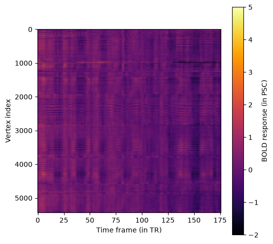
In the heatmap, the four ascend-descend cycles in the timecourses are better visible, although their exact timing varies between vertices.
The goal of our pRF model is to predict these cycles as closely as possible. By comparing how similar the pRF model predictions are to the observed timecourses, we can identify vertices and areas of the brain that respond to our visual stimulus. This allows us to create a stimulus-specific pRF map of the brain. In this example, however, we already know that the selected vertices respond to our stimulus. For an example that analyzes timecourses from all vertices in a recording, take a look at Fitting a 2D population receptive field model to fMRI data from a visual experiment.
Defining the pRF model
Now that we have our BOLD response data and stimulus in place, we can create a pRF model to predict a response to this stimulus. We use the canonical 1D pRF model proposed by Harvey et al. (2013): It assumes that the stimulus (numerosity) elicits a response that follows a Gaussian shape in one-dimensional log-numerosity space. This response is convolved with an impulse response that follows the shape of the hemodynamic response in the brain. Finally, a baseline and amplitude parameter shift and scale our predicted response to match the observed BOLD response.
The prfmodel.models.prf.Gaussian1DPRFModel class performs all these steps to make a combined prediction. However, we need to add a custom impulse response model to account for the fact that each time frame is one TR (2.1 seconds; the default in prfmodel is 1.0 seconds). Thus, we set the resolution of our predicted impulse response to the TR so that the predicted response has the same sampling rate as the observed timecourses (see also the section Important details).
from prfmodel.impulse import DerivativeTwoGammaImpulse
from prfmodel.models.prf import Gaussian1DPRFModel

# Define repetition time (TR)
TR = 2.1

# Create custom impulse model. Each frame is sampled at its leading edge, so the first
# frame sits at t = 0 (where the response is zero) and no offset is needed.
impulse_model = DerivativeTwoGammaImpulse(resolution=TR)
We can visualize the predicted impulse response. The two-gamma parameters (delay, dispersion, undershoot,
u_dispersion, ratio) default to the Glover HRF parameter set
(see default_two_gamma_impulse_glover_hrf()), so we only need to set weight_deriv. This parameter weights the temporal derivative of the two-gamma response and absorbs small differences in hemodynamic latency between vertices. Negative values shift the response earlier in time, positive values later. We start from -0.5 and let the fitter refine it per vertex further below.
import pandas as pd

# Only weight_deriv is set; the two-gamma parameters use the model's default Glover HRF values
impulse_default_params = pd.DataFrame(
    {
        "weight_deriv": [-0.5],
    }
)

# Predict impulse response (two-gamma parameters use the default Glover HRF values)
impulse_response = np.asarray(impulse_model(impulse_default_params))

fig = px.line(
    pd.DataFrame({"Time frame (in TR)": np.arange(impulse_response.shape[1]), "Impulse response": impulse_response[0]}),
    x="Time frame (in TR)",
    y="Impulse response",
    title="Predicted impulse response",
)
fig.update_layout(height=450)
fig.show()
We insert the impulse model into the Gaussian1DPRFModel that makes combined model predictions.
# Define pRF model with custom impulse response submodel
prf_model = Gaussian1DPRFModel(
    impulse_model=impulse_model,
)
As mentioned above, the numerosity stimulus includes a pre-scan interval of six time frames during which no BOLD response was recorded. However, the subject has still seen the pre-scan interval and thus it also elicits a neural response that carries over to the recorded interval. We need to include it in our model prediction even though this interval of the prediction cannot be compared against the observed neural time courses. Instead, we remove the first six time frames of all model predictions using a small wrapper function for the models call method. The resulting predictions match the timing of the recorded responses.
from typing import Callable
from prfmodel.stimuli import PRFStimulus
from prfmodel.typing import Tensor


def remove_prescan(fn: Callable, num_prescan_frames: int) -> Callable:
    """Modify a model ``call`` function so that the first ``num_prescan_frames`` are removed from its predictions."""

    def wrapper(stimulus: PRFStimulus, parameters: pd.DataFrame, *args, **kwargs) -> Tensor:
        predictions = fn(stimulus, parameters, *args, **kwargs)
        return predictions[:, num_prescan_frames:]

    return wrapper


prf_model.call = remove_prescan(prf_model.call, 6)
We define a set of starting parameters to make a combined prediction with our pRF model. Specifically, we predict the model response for each unique numerosity value in the stimulus.
# Combine pRF starting parameters with impulse response default parameters
num_unique_numerosities = len(unique_log_numerosities)

start_params = pd.DataFrame(
    {
        "mu": unique_log_numerosities,
        "sigma": [1.0] * num_unique_numerosities,
        "baseline": [0.0] * num_unique_numerosities,
        "amplitude": [1.0] * num_unique_numerosities,
        "weight_deriv": [-0.5] * num_unique_numerosities,
    },
)

# Make prediction with pRF model
simulated_response = np.asarray(prf_model(stimulus, start_params))

# Convert to data frame for plotting
simulated_response_df = pd.DataFrame(
    simulated_response.T,
    columns=unique_numerosities.astype(int),
)

fig = px.line(
    simulated_response_df,
    animation_frame="variable",
    range_x=(0, stimulus.design.shape[0]),
    labels={
        "index": "Time frame",
        "value": "Predicted neural response",
        "variable": "Numerosity (natural scale)",
    },
)
fig.update_layout(showlegend=False, height=450)
fig.show()
Fitting the pRF model
In this example, we will evaluate our pRF model using cross-validation by fitting it on the BOLD responses from the odd runs and evaluating its predictions on the even runs. This will give us an indication of how well our model can predict out-of-sample time courses.
We will fit the pRF model to our BOLD response data using two stages. We begin with a grid search to find good values for our parameters of interest (mu and sigma). Then, we use least squares to estimate the baseline and amplitude of
our model. Finally, we use stochastic gradient descent (SGD) to finetune our model fits after the least-squares stage.
Let’s start with the grid search by defining ranges of mu and sigma that we want to construct a grid
of parameter values from. For baseline and amplitude, we only provide a single value so that they will stay constant
across the entire grid. The two-gamma parameters of the impulse model are omitted entirely: the impulse model supplies
them from its default Glover HRF parameter set. However, if we wanted to override the default parameters, we could also
add ranges for them here.
param_ranges = {
    "mu": np.linspace(np.log(0.7), np.log(10), 50),
    "sigma": np.linspace(0.005, 3.0, 50),
    # delay, dispersion, undershoot, u_dispersion, and ratio use the default Glover HRF parameters
    "weight_deriv": [-0.5],
    "baseline": [0.0],
    "amplitude": [1.0],
}
For both parameters, we defined ranges of values that will be used to construct the grid. That is, the grid search will evaluate all possible combinations of these values and return the combination that fits the observed data best. This will result in a grid containing \(50 \times 50 = 2500\) parameter combinations. This is still a relatively small grid and we recommend specifying finer grids in practice.
Two properties of the stimulus bound what these ranges can achieve. First, mu stops at \(\log(10)\) and thus deliberately excludes the baseline numerosity 20: a vertex that is genuinely tuned to 20 cannot be recovered here and will pile up against the upper end of the grid. Second, the stimulus samples log-numerosity space at only eight points that are at least \(\log(2) - \log(1) \approx 0.69\) apart. A pRF much narrower than that spacing responds to a single numerosity no matter how small sigma becomes, so the lower end of the sigma range is not identifiable from these data and estimates near the floor should be read as “no wider than one stimulus level”.
Let’s construct the prfmodel.fitters.GridFitter and perform the grid search. Note that we set batch_size=20 to let the prfmodel.fitters.GridFitter
evaluate 20 parameter combinations at the same time (which saves us some memory). By default, the loss (i.e., the metric to minimize between model predictions and data) is the negative correlation, which ignores differences in baseline and amplitude between model predictions and observed data. This means the data do not need to be demeaned or converted to percent signal change first, but also that baseline and amplitude cannot be estimated by the grid search itself. We fix them here and estimate them with least squares in the next step.
from prfmodel.fitters import GridFitter

# Create grid fitter object
grid_fitter = GridFitter(
    model=prf_model,
    stimulus=stimulus,
    compile_step=True,  # Setting 'compile_step=True' speeds up the fitting
)

# Run grid search
grid_history, grid_params = grid_fitter.fit(
    data=response_psc_odd,
    parameter_values=param_ranges,
    batch_size=20,
)

grid_params
| mu | sigma | weight_deriv | baseline | amplitude | |
|---|---|---|---|---|---|
| 0 | 0.837 | 0.983 | -0.5 | 0.0 | 1.0 |
| 1 | 1.054 | 0.983 | -0.5 | 0.0 | 1.0 |
| 2 | -0.357 | 1.533 | -0.5 | 0.0 | 1.0 |
| 3 | -0.357 | 1.472 | -0.5 | 0.0 | 1.0 |
| 4 | 1.109 | 0.555 | -0.5 | 0.0 | 1.0 |
| ... | ... | ... | ... | ... | ... |
| 5431 | 0.566 | 0.677 | -0.5 | 0.0 | 1.0 |
| 5432 | -0.357 | 2.511 | -0.5 | 0.0 | 1.0 |
| 5433 | -0.248 | 3.000 | -0.5 | 0.0 | 1.0 |
| 5434 | 0.512 | 1.227 | -0.5 | 0.0 | 1.0 |
| 5435 | 0.295 | 0.372 | -0.5 | 0.0 | 1.0 |
5436 rows × 5 columns
We can see that the estimates for mu, and sigma are one combination in our grid. In the second step,
we also optimize the amplitude of the pRF model together with the baseline using least squares. This adjusts the
scale of our model predictions to scale the observed data. We set batch_size=200 to estimate least-squares fits
for batches of vertices sequentially and save memory.
from prfmodel.fitters import LeastSquaresFitter

# Create least-squares fitter
ls_fitter = LeastSquaresFitter(
    model=prf_model,
    stimulus=stimulus,
)

# Run least squares fit
ls_history, ls_params = ls_fitter.fit(
    data=response_psc_odd,
    parameters=grid_params,
    slope_name="amplitude",
    intercept_name="baseline",
    batch_size=200,
)

ls_params
| mu | sigma | weight_deriv | baseline | amplitude | |
|---|---|---|---|---|---|
| 0 | 0.837 | 0.983 | -0.5 | -0.135 | 0.635 |
| 1 | 1.054 | 0.983 | -0.5 | -0.098 | 0.423 |
| 2 | -0.357 | 1.533 | -0.5 | -0.148 | 1.414 |
| 3 | -0.357 | 1.472 | -0.5 | -0.132 | 1.275 |
| 4 | 1.109 | 0.555 | -0.5 | -0.044 | 0.160 |
| ... | ... | ... | ... | ... | ... |
| 5431 | 0.566 | 0.677 | -0.5 | -0.117 | 0.616 |
| 5432 | -0.357 | 2.511 | -0.5 | -0.424 | 4.037 |
| 5433 | -0.248 | 3.000 | -0.5 | -0.641 | 6.363 |
| 5434 | 0.512 | 1.227 | -0.5 | -0.148 | 0.855 |
| 5435 | 0.295 | 0.372 | -0.5 | -0.038 | 0.275 |
5436 rows × 5 columns
We can see that the amplitudes are different compared to the starting value (and our initial guess) for many vertices.
To finetune the parameter estimates with SGD, we use the SGDFitter with the
least-squares parameters as starting values. Because the size of the pRF sigma is a strictly positive parameter
(always > 0), we include an adapter with a log-transformation in the fitter. The adapter log-transforms sigma so that
the fitter can optimize it on an unconstrained scale, and transforms it back to the strictly positive scale before
model predictions are compared against the observed data.
By default, SGDFitter optimizes every parameter column it is given, so weight_deriv is refined per vertex here as well. This lets each vertex have a slightly different hemodynamic latency, but it also means that the shape of the impulse response is no longer fixed while mu and sigma are estimated. Pass fixed_parameters=["weight_deriv"] to fit to keep the impulse response identical across vertices instead.
from keras import ops
from prfmodel.fitters import SGDFitter
from prfmodel.fitters.adapter import Adapter, ParameterTransform

adapter = Adapter([ParameterTransform(["sigma"], transform_fun=ops.log, inverse_fun=ops.exp)])

sgd_fitter = SGDFitter(
    model=prf_model,
    stimulus=stimulus,
    adapter=adapter,
    compile_step=True,  # Setting 'compile_step=True' speeds up the fitting
)

sgd_history, sgd_params = sgd_fitter.fit(
    data=response_psc_odd,
    init_parameters=ls_params,
)

sgd_params
| mu | sigma | weight_deriv | baseline | amplitude | |
|---|---|---|---|---|---|
| 0 | 0.833 | 0.993 | -0.208 | -0.137 | 0.648 |
| 1 | 1.077 | 0.982 | -0.257 | -0.100 | 0.427 |
| 2 | -0.617 | 1.609 | 0.029 | -0.145 | 1.617 |
| 3 | -0.510 | 1.557 | -0.227 | -0.135 | 1.414 |
| 4 | 1.143 | 0.533 | -0.257 | -0.044 | 0.155 |
| ... | ... | ... | ... | ... | ... |
| 5431 | 0.577 | 0.633 | -0.953 | -0.110 | 0.580 |
| 5432 | -0.386 | 2.519 | -1.170 | -0.422 | 4.065 |
| 5433 | -0.230 | 3.000 | -1.070 | -0.644 | 6.373 |
| 5434 | 0.492 | 1.251 | -0.987 | -0.150 | 0.880 |
| 5435 | 0.341 | 0.297 | -1.106 | -0.037 | 0.284 |
5436 rows × 5 columns
We can see that SGD has substantially changed parameter estimates for some vertices.
Now that the core pRF parameters and the auxiliary baseline and amplitude parameters are optimized, we can
compare the model predictions against the observed responses. Because we want to make predictions for all vertices in
the brain, we wrap our prf_model in the prfmodel.utils.batched() modifier function. The modifier changes the behavior of the model
to make predictions for batches of vertices sequentially. This saves us a lot of memory at the expense of minimal runtime
overhead.
from prfmodel.utils import batched

prf_model_batched = batched(prf_model)

pred_response = np.asarray(prf_model_batched(stimulus, sgd_params, batch_size=100))
We can quantify how well the predictions align with the observed timecourses using the R-squared metric. This metric indicates the proportion of variance in the observed data explained by our model predictions. We start by comparing the model predictions to the observed timecourses from the odd runs. We used the odd runs to fit our pRF model so we are assessing its in-sample fit.
from keras.metrics import R2Score

r2_metric = R2Score(class_aggregation=None)  # Don't aggregate score over vertices

r_squared_odd = np.asarray(
    r2_metric(response_psc_odd.T, pred_response.T)
)  # Transpose to compute score across time frames
r_squared_odd.shape
(5436,)
We can also compute the R-squared on the even runs to assess the out-of-sample fit.
r2_metric.reset_state()
r_squared_even = np.asarray(
    r2_metric(response_psc_even.T, pred_response.T)
)  # Transpose to compute score across time frames
r_squared_even.shape
(5436,)
We can look at the distribution of R-squared values across vertices.
fig, (ax1, ax2) = plt.subplots(1, 2)

ax1.hist(np.clip(r_squared_odd, 0, 1))
ax1.set_title("Odd runs (in-sample)")
ax1.set_ylabel("Count")
ax2.hist(np.clip(r_squared_even, 0, 1))
ax2.set_title("Even runs (out-of-sample)")

for ax in (ax1, ax2):
    ax.set_xlim(0, 1)
    ax.set_ylim(0, 2500)
    ax.set_xlabel("R-squared")

fig.tight_layout()
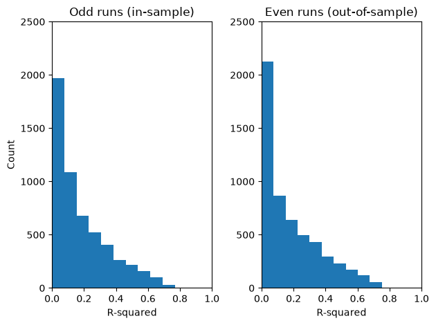
Note that the histograms clip the scores to \([0, 1]\): R-squared is negative whenever a prediction fits worse than the mean of the data, and those vertices all end up in the leftmost bin.
For both odd and even runs, we can see that quite a few vertices have a score at or close to zero meaning that the pRF model does not predict the observed response well. This means that, given the model, not all vertices in the selected ROIs respond to our numerosity stimulus. However, a substantial amount of vertices also have higher scores, suggesting that the model successfully mapped their responses to the stimulus. Moreover, the R-squared distribution does not differ much between in-sample and out-of-sample predictions, suggesting that our pRF model generalizes well.
Let’s plot the predicted and the observed timecourses for a subsample of vertices from the even (out-of-sample) runs.
import plotly.graph_objects as go

each_k = 50

# Sort vertices according to R-squared
best_vertices = np.flip(np.argsort(r_squared_even))[::each_k]

response_valid_best_vertices = response_psc_even[best_vertices]
pred_response_best_vertices = pred_response[best_vertices]
r_squared_valid_best_vertices = r_squared_even[best_vertices]
sigma_best_vertices = sgd_params["sigma"].values[best_vertices]
mu_exp_best_vertices = np.exp(sgd_params["mu"].values[best_vertices])

df_valid = pd.DataFrame(response_valid_best_vertices.T)
df_pred = pd.DataFrame(pred_response_best_vertices.T)

df_valid["source"] = "Observed"
df_pred["source"] = "Predicted"

df = pd.concat([df_valid, df_pred], axis=0)
df["time"] = np.tile(np.arange(df_valid.shape[0]), 2)

df_melted = df.melt(id_vars=["source", "time"], var_name="vertex", value_name="response")

fig = px.line(
    df_melted,
    x="time",
    y="response",
    color="source",
    animation_frame="vertex",
    range_y=[-5, 5],
    labels={
        "time": "Time frame (in TR)",
        "response": "BOLD response (in PSC)",
        "vertex": "Vertex",
        "source": "",
    },
    title="Observed and predicted vertex responses (subsampled vertices; even runs)",
)

# Add a text trace to display per-vertex stats; this will be updated in each animation frame
fig.add_trace(
    go.Scatter(
        x=[60],
        y=[4.7],
        mode="text",
        text=[
            f"R-squared = {r_squared_valid_best_vertices[0]:.3f}, sigma = {sigma_best_vertices[0]:.3f}, pref numerosity = {mu_exp_best_vertices[0]:.3f}"
        ],
        showlegend=False,
        hoverinfo="skip",
        textfont=dict(size=13),
    )
)

# Append a stats text update to each animation frame's trace data
for i, frame in enumerate(fig.frames):
    r2 = r_squared_valid_best_vertices[i]
    sigma = sigma_best_vertices[i]
    mu_exp = mu_exp_best_vertices[i]
    frame.data = list(frame.data) + [
        go.Scatter(
            text=[f"R-squared = {r2:.3f}, sigma = {sigma:.3f}, pref numerosity = {mu_exp:.3f}"],
        )
    ]

fig.update_layout(showlegend=True, height=450)
fig.show()
The plot confirms a high alignment between model predictions and observed responses for vertices with high R-squared.
Analyzing the pRF results
To analyze and interpret the pRF parameters, we will zoom in on vertices with out-of-sample R-squared > 0.1 which is roughly 55% of the vertices in the selected ROIs (note that this threshold is somewhat arbitrary).
# Create mask for vertices above R-squared threshold
is_above_threshold = r_squared_even > 0.1

# Compute proportion of vertices above threshold
is_above_threshold.mean()
np.float64(0.5507726269315674)
We further exclude vertices whose preferred numerosity falls outside the displayed numerosities 1 to 7, excluding 20
because it served as the baseline. We also remove vertices whose pRF size (sigma) approaches the span of the
log-numerosity space (\(\log(20) \approx 3.0\)), because such a wide Gaussian predicts an almost flat line, which leaves
mu unidentifiable. Note that SGD optimizes sigma on an unconstrained log scale, so the estimates are no longer
capped by the grid we defined above.
is_valid = (
    is_above_threshold
    & (np.exp(sgd_params["mu"]).between(1, 7))
    & (sgd_params["sigma"] < 2.8)
)
is_valid.mean()
np.float64(0.2934142752023547)
We add the ROI labels to each vertex in the parameters dataframe and transform mu into preferred numerosity.
final_params = sgd_params.copy()
final_params["roi"] = [roi_mapping[idx] for idx in roi_index]
final_params["numerosity"] = np.exp(final_params["mu"])

params_valid = final_params.loc[is_valid].copy()

# Order the ROIs anatomically (occipital -> central sulcus -> frontal). Without this, 'groupby'
# below would sort them alphabetically and no longer match the order of 'roi_mapping'.
roi_order = list(roi_mapping.values())
params_valid["roi"] = pd.Categorical(params_valid["roi"], categories=roi_order, ordered=True)
Now, we can compare the average preferred numerosity between ROIs. We also keep the number of surviving vertices per ROI, because it varies by an order of magnitude and tells us how many data points go into each average.
params_agg_roi = params_valid.groupby("roi", observed=False)[["numerosity", "sigma"]].agg(
    ["mean", "std", "count"]
)

params_agg_roi.round(2)
| numerosity | sigma | |||||
|---|---|---|---|---|---|---|
| mean | std | count | mean | std | count | |
| roi | ||||||
| NTO | 3.48 | 1.66 | 199 | 1.16 | 0.57 | 199 |
| NLO | 4.14 | 1.55 | 32 | 1.13 | 0.50 | 32 |
| NPO | 2.80 | 0.92 | 174 | 1.08 | 0.44 | 174 |
| NPCI | 2.90 | 0.85 | 239 | 1.19 | 0.47 | 239 |
| NPCM | 2.68 | 0.83 | 379 | 1.18 | 0.48 | 379 |
| NPCS | 2.77 | 1.30 | 278 | 1.16 | 0.53 | 278 |
| NFI | 2.85 | 0.89 | 68 | 0.88 | 0.37 | 68 |
| NFS | 2.17 | 0.48 | 226 | 1.01 | 0.35 | 226 |
fig, ax = plt.subplots()

ax.errorbar(
    roi_order,
    params_agg_roi["numerosity"]["mean"],
    yerr=params_agg_roi["numerosity"]["std"],
    fmt="o",
    capsize=3,
)

ax.set_xlabel("ROI")
ax.set_ylabel("Preferred numerosity")

fig.tight_layout()
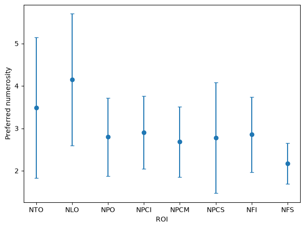
The error bars show the standard deviation across vertices, not the standard error of the mean. Average preferred numerosity is highest in the occipital maps NLO (lateral occipital) and NTO (temporal occipital) and lowest in NFS (superior frontal), while the maps around the central sulcus (NPCI, NPCM, NPCS) sit close together in between. However, the variation within each ROI is large relative to these differences, and the number of surviving vertices differs strongly between maps.
We can also look at the average pRF size of each ROI.
fig, ax = plt.subplots()

ax.errorbar(
    roi_order,
    params_agg_roi["sigma"]["mean"],
    yerr=params_agg_roi["sigma"]["std"],
    fmt="o",
    capsize=3,
)

ax.set_xlabel("ROI")
ax.set_ylabel("pRF size (sigma, in log-numerosity units)")

fig.tight_layout()
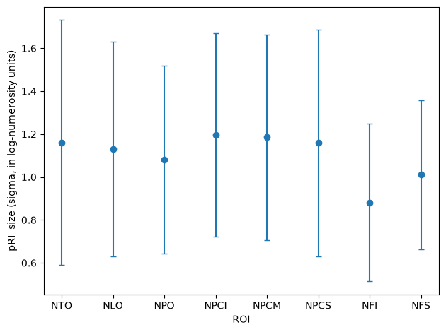
Average pRF size is roughly constant across the occipital (NTO, NLO, NPO) and central sulcus (NPCI, NPCM, NPCS) maps and somewhat smaller in the frontal maps (NFI, NFS).
Conclusion
This example showed how to fit a one-dimensional Gaussian pRF model to empirical fMRI data collected from a numerosity experiment. We only looked at a subset of vertices in ROIs that previously were shown to respond to the numerosity stimulus used in the experiment. We plotted the raw BOLD response data and we created the experimental stimulus. Then, we defined a pRF model and optimized its parameters using a grid search, followed by least-squares to adjust for baseline and amplitude differences and stochastic gradient descent to finetune all parameters. Finally, we visualized model fit and compared estimated parameters between ROIs.
Stay Tuned
More tutorials on fitting models to empirical data and creating custom models are in the making.
For questions and issues, please make an issue on GitHub or contact Malte Lüken (m.luken@esciencecenter.nl).
References
Harvey, B. M., Klein, B. P., Petridou, N., & Dumoulin, S. O. (2013). Topographic representation of numerosity in the human parietal cortex. Science, 341(6150), 1123–1126. https://doi.org/10.1126/science.1239052
Hendrikx, E., Paul, J. M., van Ackooij, M., van der Stoep, N., & Harvey, B. M. (2024). Cortical quantity representations of visual numerosity and timing overlap increasingly into superior cortices but remain distinct. NeuroImage, 286, 120515. https://doi.org/10.1016/j.neuroimage.2024.120515