Fitting a connective field model to fMRI data from a visual experiment
Author: Malte Lüken (m.luken@esciencecenter.nl)
This example shows how to fit a connective field (CF) model to blood oxygenation level-dependent (BOLD) functional magnetic resonance imaging (fMRI) data.
A CF model maps neural activity in one brain region of interest (ROI; e.g., V2 in the human visual cortex) to activity in another brain region (e.g., V1). The CF is the location in the source region that predicts neural activity in the target region. In this example, we select V1 in the visual cortex as the source region. We do not specify a target region but instead map the entire brain to V1.
Because prfmodel uses Keras for model fitting, we need to make sure that a backend is installed before we begin. In this example, we use the TensorFlow backend.
import os
from importlib.util import find_spec

# Set keras backend to 'tensorflow' (this is normally the default)
os.environ["KERAS_BACKEND"] = "tensorflow"
# Hide tensorflow info messages
os.environ["TF_CPP_MIN_LOG_LEVEL"] = "1"

if find_spec("tensorflow") is None:
    msg = "Could not find the tensorflow package. Please install tensorflow with 'pip install .[tensorflow]'"
    raise ImportError(msg)
Loading the surface
Before we start modelling, we need to make sure that we have all the requirements to visualize the BOLD response data. To visualize fMRI data, we can project it onto an anatomical surface of the brain. In this tutorial, we use a template surface based on the surface of the Human Connectome Project (see https://doi.org/10.6084/m9.figshare.13372958). For visualization, we use the nilearn package. We download the surface and load the flat meshes for both hemispheres.
from prfmodel.examples import load_surface_mesh

# Download surface mesh and load as nilearn.surface.PolyMesh object
mesh = load_surface_mesh(dest_dir="data", surface_type="flat")
WARNING: All log messages before absl::InitializeLog() is called are written to STDERR
I0000 00:00:1784809530.100891    3998 cudart_stub.cc:31] Could not find cuda drivers on your machine, GPU will not be used.
WARNING: All log messages before absl::InitializeLog() is called are written to STDERR
I0000 00:00:1784809531.376916    3998 cudart_stub.cc:31] Could not find cuda drivers on your machine, GPU will not be used.
Loading the BOLD response
Now that we have the flat surface, we load the raw BOLD response data from a single subject that can be represented on the surface mesh. We load data from both hemispheres of the subject by setting hemisphere="both".
%matplotlib inline
import matplotlib.pyplot as plt
from prfmodel.examples import load_single_subject_fmri_data

response_raw = load_single_subject_fmri_data(dest_dir="data", hemisphere="both")
response_raw.shape  # shape (num_vertices, num_frames)
(118584, 120)
The BOLD response time courses have 120 time frames. We convert the raw BOLD response signal to percent signal change (PSC).
response_psc = ((response_raw.T / response_raw.mean(axis=1)).T - 1.0) * 100.0
The response_psc object contains the BOLD response timecourse for each voxel on the surface mesh. It has shape (num_vertices, num_frames) where num_vertices is the number of vertices on the surface mesh and num_frames the number of time frames of the recording. The timecourses from the left and right hemispheres are concatenated (left is first). Because the data has been converted to PSC, each timecourse should have a mean of zero.
First, we define a helper function to plot a statistic on the surface.
import numpy as np
from nilearn.plotting import plot_surf_stat_map

SURF_VIEW = (90, 270)


def plot_surf_stat_map_helper(
        stat_map: np.ndarray,
        vmin: float | None = None,
        vmax: float | None = None,
        title: str | None = None,
    ) -> tuple[plt.Figure, plt.Axes]:
    """Helper function to plot a surface with a stat map."""
    fig, ax = plt.subplots(subplot_kw={"projection": "3d"}, figsize=(8, 6))

    plot_surf_stat_map(
        mesh,
        stat_map,
        vmin=vmin,
        vmax=vmax,
        hemi="both",
        view=SURF_VIEW,
        cmap="inferno",
        axes=ax,
        figure=fig,
        title=title,
    )

    # Expand the 3D axes to fill the space to the left of the colorbar
    surf_axes = [a for a in fig.axes if a.name == "3d"]
    cbar_axes = [a for a in fig.axes if a.name != "3d"]
    cbar_x0 = min(a.get_position().x0 for a in cbar_axes)
    for a in surf_axes:
        a.set_position([0.0, 0.0, cbar_x0 - 0.01, 0.97])

    return fig, ax
We can then plot the standard deviation of each timecourse on the surface.
# Calculate standard deviation of each timecourse
response_sd = response_psc.std(axis=1)

plot_surf_stat_map_helper(response_sd, vmax=5.0, title="Response standard deviation");
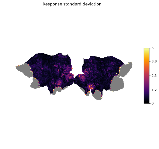
We can see that there is high variation in the signal in the visual areas (e.g., V1-V3) as we would expect for a visual stimulus.
Inspecting the data
Before we model the BOLD response, we look at the timecourses and inspect the quality of the data. We start by looking at the timecourses of our source region V1. We select the vertices that have been assigned to V1 through a multi-modal parcellation (MMP) atlas based on Glasser et al. (2016).
import plotly.io as pio
import plotly.express as px

pio.renderers.default = "notebook_connected"  # Requires internet connection to work
pio.templates.default = "simple_white"

# The atlas comes with the surface mesh
atlas = np.load("data/hcp_999999/surface-info/mmp_atlas.npz")

# V1 has label 1
label_v1 = 1

# Concatenate labels from both hemispheres (left is first)
is_v1 = np.concatenate([
    atlas["left"] == label_v1,
    atlas["right"] == label_v1,
])
We then plot the BOLD response for each vertex in V1 over time. Note that the unit of time frames is repetition time (TR) which is 1.5 seconds for this dataset.
response_psc_v1 = response_psc[is_v1]

fig = px.line(
    response_psc_v1[::10].T,
    animation_frame="variable",
    range_x=(0, 120),
    range_y=(-5, 5),
    labels={
        "index": "Time frame (in TR)",
        "value": "BOLD response (in PSC)",
        "variable": "V1 vertex",
    },
    title="V1 vertex timecourses",
)
fig.update_layout(showlegend=False, height=450)
fig.show()
While the timecourses are quite noisy, we can see that, for some vertices, there are four regular peaks in the signal. These peaks originate from the visual stimulus that was shown during the fMRI recording. The visual stimulus contained four corresponding bars moving through the visual field in different directions (see Fitting a 2D population receptive field model to fMRI data from a visual experiment). The goal of our CF model is to map these responses to the responses from other vertices in the brain.
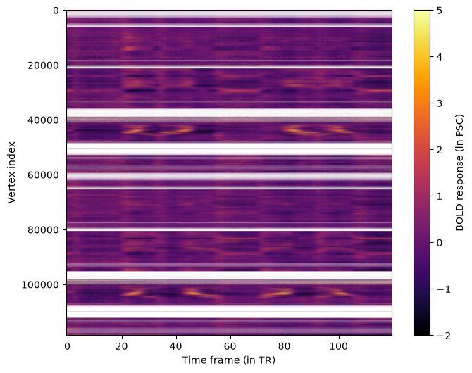
We can get an overview of all vertices by plotting all timecourses at once in a heatmap.
aspect_ratio = response_psc.shape[1] / response_psc.shape[0]

fig, ax = plt.subplots(1, 1, figsize=(8, 6))

im = ax.imshow(
    response_psc,
    aspect=aspect_ratio,
    cmap="inferno",
    vmin=-2,
    vmax=5,
)

ax.set_xlabel("Time frame (in TR)")
ax.set_ylabel("Vertex index")
fig.colorbar(im, ax=ax, label="BOLD response (in PSC)");
Creating the Distance Matrix
The input for CF models is the response in the source region (which we have already identified) and a distance matrix between vertices in that region. To compute this distance matrix we define a helper function that loads a white matter surface from a GIFTI file, transforms the surface into a sparse graph, and applies Dijkstra’s algorithm to find the weighted shortest paths between all vertices in our source region.
Note - distance matrix construction: There are alternative ways of constructing a distance matrix on the cortical surface. For example, the Heat method computes the geodesic distance between vertices on the surface.
from collections.abc import Sequence

import nibabel as nib
from scipy.sparse import csr_matrix
from scipy.sparse.csgraph import dijkstra

def calculate_distance_matrix_dijkstra(surface_path: str, source_indices: Sequence) -> np.ndarray:
    """Calculate the distance matrix for a sequence of source region vertex indices from a surface file."""
    img = nib.load(surface_path)

    coords, triangles = img.agg_data()

    i, j, k = triangles.T
    edges = np.vstack((np.column_stack((i, j)),
                       np.column_stack((j, k)),
                       np.column_stack((k, i))))

    v_start = coords[edges[:, 0]]
    v_end = coords[edges[:, 1]]
    dist = np.linalg.norm(v_start - v_end, axis=1)

    n_verts = coords.shape[0]

    graph = csr_matrix((dist, (edges[:, 0], edges[:, 1])), shape=(n_verts, n_verts))

    vert_is_source = np.isin(np.arange(n_verts), source_indices)
    graph_source = graph[:, vert_is_source]
    graph_source = graph_source[vert_is_source, :]

    dist_matrix = dijkstra(csgraph=graph_source, directed=False)

    return dist_matrix
We identify the indices of vertices in our source region V1 and compute the distance matrices for each hemisphere separately to exclude connections between the hemispheres. We combine both matrices and set inter-hemisphere distances to infinity indicating that connective fields cannot map across hemispheres.
idx_v1_left = np.where(atlas["left"] == label_v1)[0]
idx_v1_right = np.where(atlas["right"] == label_v1)[0]

dist_matrix_lh = calculate_distance_matrix_dijkstra("data/hcp_999999/surfaces/wm_lh.gii", idx_v1_left)
dist_matrix_rh = calculate_distance_matrix_dijkstra("data/hcp_999999/surfaces/wm_rh.gii", idx_v1_right)

# We pad both matrices with infinity values and then concatenate
dist_matrix = np.concatenate([
    np.pad(dist_matrix_lh, [(0, 0), (0, dist_matrix_rh.shape[1])], constant_values=np.inf),
    np.pad(dist_matrix_rh, [(0, 0), (dist_matrix_lh.shape[1], 0)], constant_values=np.inf),
])

dist_matrix.shape
(2939, 2939)
We can plot the final distance matrix.
fig, ax = plt.subplots(1, 1, figsize=(8, 6))

im = ax.imshow(
    dist_matrix,
    cmap="inferno",
)

ax.set_xlabel("Vertex index (V1)")
ax.set_ylabel("Vertex index (V1)")
fig.colorbar(im, ax=ax, label="Distance (in mm)");
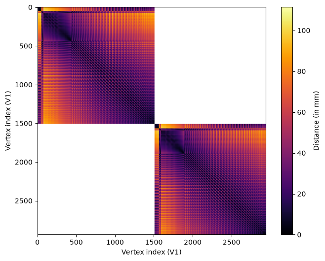
We can see that the distances vary across vertices according to a regular pattern. This is due to the regular position of vertices on the surface mesh.
We combine the distance matrix and the response in the source region in a prfmodel.stimuli.CFStimulus object that we use as input for our
CF model.
from prfmodel.stimuli import CFStimulus

stimulus = CFStimulus(distance_matrix=dist_matrix, source_response=response_psc_v1)

print(stimulus)
CFStimulus(distance_matrix=array[2939, 2939], source_response=array[2939, 120])
Defining the CF model
Now that we have our BOLD response data and stimulus in place, we can create a CF model to predict a response to this stimulus. We use the standard Gaussian CF model that is described in Haak et al. (2013): It assumes that the stimulus (a vertex in the distance matrix) elicits a response that follows a Gaussian shape in two-dimensional cortical space. A baseline and amplitude parameter shift and scale the predicted response to match the observed BOLD response.
The prfmodel.models.gaussian.GaussianCFModel class performs these steps to make a combined prediction.
import pandas as pd
from prfmodel.models.cf import GaussianCFModel

cf_model = GaussianCFModel()
The prfmodel.models.gaussian.GaussianCFModel class requires two core parameters: center_index indicates the location of the CF in the
source region. With the current CF implementation in prfmodel, this must be a vertex index in the distance matrix/source
region. This means that the center of a CF must be a vertex on the surface mesh (i.e., it cannot be in between vertices).
We generate predictions for a range of center_index values to visualize how the predicted response changes across different CF locations.
# Generate predictions for a subset of center_index values
preview_center_indices = np.arange(0, response_psc_v1.shape[0], 10)
preview_params = pd.DataFrame({
    "center_index": preview_center_indices.astype(float),
    "sigma": 1.0,
    "baseline": 0.0,
    "amplitude": 1.0,
})
preview_predictions = np.asarray(cf_model(stimulus, preview_params))

fig = px.line(
    preview_predictions.T,
    animation_frame="variable",
    range_x=(0, 120),
    range_y=(-2, 2),
    labels={
        "index": "Time frame (in TR)",
        "value": "BOLD response (in PSC)",
        "variable": "Center index",
    },
    title="Predicted CF response for different center indices",
)
fig.update_layout(showlegend=False, height=450)
fig.show()
E0000 00:00:1784809551.064681 3998 cuda_platform.cc:52] failed call to cuInit: INTERNAL: CUDA error: Failed call to cuInit: UNKNOWN ERROR (303)
Fitting the CF model
Before we start fitting the CF model to the BOLD timecourse, we need to filter out vertices with missing data, that is, vertices containing NaN values. We filter out all vertices that have
missing BOLD response measurements.
response_is_valid = np.all(np.isfinite(response_psc), axis=1)
response_valid = response_psc[response_is_valid]

is_v1_valid = is_v1[response_is_valid]
We will fit the CF model to our BOLD response data using two stages. We begin with a grid search using prfmodel.fitters.grid.GridFitter to find good values for our parameters of interest (center_index, and sigma). Then, we use prfmodel.fitters.linear.LeastSquaresFitter to estimate the baseline and amplitude of
our model.
Note: Typically, we would also use stochastic gradient descent (SGD) to finetune our model fits after the least-squares stage. To keep the example computationally simple, we omit this step here but encourage readers to explore this approach at the end. Importantly, we can only optimize continuous parameters with SGD, so
center_indexmust be a fixed value.
Let’s start with the grid search by defining ranges of center_index and sigma that we want to construct a grid
of parameter values from. For baseline and amplitude, we only provide a single value so that they will stay constant
across the entire grid.
param_ranges = {
    "center_index": np.arange(dist_matrix.shape[0]),  # We test every vertex in the source region
    "sigma": np.linspace(0.005, 20.0, 10),
    "baseline": [0.0],
    "amplitude": [1.0],
}
The grid search will evaluate all possible combinations of the defined ranges and return the combination that fits the simulated data best. Note that this is still a relatively small grid and we recommend specifying finer grids in practice.
Let’s construct the prfmodel.fitters.grid.GridFitter and perform the grid search. Note that we set batch_size=20 to let the prfmodel.fitters.grid.GridFitter
evaluate 20 parameter combinations at the same time (which saves us some memory). By default, the loss (i.e., the metric to minimize between model predictions and data) is cosine similarity, which ignores differences in scale between model predictions and observed data.
from prfmodel.fitters import GridFitter

# Create grid fitter object
grid_fitter = GridFitter(
    model=cf_model,
    stimulus=stimulus,
)

# Run grid search
grid_history, grid_params = grid_fitter.fit(
    data=response_valid,
    parameter_values=param_ranges,
    batch_size=20,
)
W0000 00:00:1784809552.054228    3998 cpu_allocator_impl.cc:82] Allocation of 897926400 exceeds 10% of free system memory.
W0000 00:00:1784809552.177557    3998 cpu_allocator_impl.cc:82] Allocation of 897926400 exceeds 10% of free system memory.
W0000 00:00:1784809552.294241    3998 cpu_allocator_impl.cc:82] Allocation of 897926400 exceeds 10% of free system memory.
W0000 00:00:1784809552.412327    3998 cpu_allocator_impl.cc:82] Allocation of 897926400 exceeds 10% of free system memory.
W0000 00:00:1784809552.526549    3998 cpu_allocator_impl.cc:82] Allocation of 897926400 exceeds 10% of free system memory.
grid_params
| center_index | sigma | baseline | amplitude | |
|---|---|---|---|---|
| 0 | 2273.0 | 0.005000 | 0.0 | 1.0 |
| 1 | 1263.0 | 0.005000 | 0.0 | 1.0 |
| 2 | 2714.0 | 0.005000 | 0.0 | 1.0 |
| 3 | 1667.0 | 0.005000 | 0.0 | 1.0 |
| 4 | 593.0 | 4.448333 | 0.0 | 1.0 |
| ... | ... | ... | ... | ... |
| 93529 | 1993.0 | 0.005000 | 0.0 | 1.0 |
| 93530 | 169.0 | 0.005000 | 0.0 | 1.0 |
| 93531 | 764.0 | 0.005000 | 0.0 | 1.0 |
| 93532 | 2698.0 | 0.005000 | 0.0 | 1.0 |
| 93533 | 1993.0 | 0.005000 | 0.0 | 1.0 |
93534 rows × 4 columns
We can see that the estimates for center_index and sigma are one combination in our grid. In the second step,
we also optimize the amplitude of the pRF model together with the baseline using least squares. This adjusts the
scale of our model predictions to scale the observed data.
from prfmodel.fitters import LeastSquaresFitter

# Create least-squares fitter
ls_fitter = LeastSquaresFitter(
    model=cf_model,
    stimulus=stimulus,
)

# Run least squares fit
ls_history, ls_params = ls_fitter.fit(
    data=response_valid,
    parameters=grid_params,
    slope_name="amplitude",  # Names of parameters to be optimized with least squares
    intercept_name="baseline",
    batch_size=200,
)
ls_params
| center_index | sigma | baseline | amplitude | |
|---|---|---|---|---|
| 0 | 2273.0 | 0.005000 | -7.481560e-09 | 0.012313 |
| 1 | 1263.0 | 0.005000 | -9.521984e-09 | 0.003259 |
| 2 | 2714.0 | 0.005000 | -2.720568e-09 | 0.009706 |
| 3 | 1667.0 | 0.005000 | 1.360284e-08 | 0.001414 |
| 4 | 593.0 | 4.448333 | 2.584539e-08 | 0.619232 |
| ... | ... | ... | ... | ... |
| 93529 | 1993.0 | 0.005000 | 5.441134e-09 | 0.007682 |
| 93530 | 169.0 | 0.005000 | -2.040426e-09 | 0.000907 |
| 93531 | 764.0 | 0.005000 | -2.448511e-08 | 0.007801 |
| 93532 | 2698.0 | 0.005000 | 2.720567e-09 | 0.004320 |
| 93533 | 1993.0 | 0.005000 | 3.264680e-08 | 0.012339 |
93534 rows × 4 columns
We can see that the amplitudes are substantially lower compared to the starting value (and our initial guess) for many vertices.
Now that the core CF parameters and the auxiliary baseline and amplitude parameters are optimized, we can
compare the model predictions against the observed responses. Because we want to make predictions for all vertices in
the brain, we wrap our cf_model in the prfmodel.utils.batched() modifier function. The modifier changes the behavior of the model
to make predictions for batches of vertices sequentially. This saves us a lot of memory at the expense of minimal runtime
overhead.
from prfmodel.utils import batched

predict_batched = batched(cf_model)

# Make predictions with optimized parameters
pred_response = np.asarray(predict_batched(stimulus, ls_params, batch_size=200))
We can quantify how well the predictions align with the observed timecourses using the R-squared metric. This metric indicates the proportion of variance in the observed data explained by our model predictions.
from keras.metrics import R2Score

r2_metric = R2Score(class_aggregation=None)  # Don't aggregate score over vertices

r_squared = np.asarray(r2_metric(response_valid.T, pred_response.T))  # Transpose to compute score across time frames
r_squared.shape
(93534,)
We can look at the distribution of R-squared values across vertices.
fig = px.histogram(
    x=r_squared,
    nbins=15,
    labels={"x": "R-squared"},
).update_layout(yaxis_title="Frequency", height=450)
fig.show()
We can see that many vertices have a score above zero meaning that the response of the CF model matches the observed response. A substantial amount of vertices also have higher scores, suggesting that the CF model successfully maps different brain regions to the source region V1. Note that some vertices have a perfect score of \(\approx 1\). These are the vertices in V1 which are perfectly mapped onto themselves.
Let’s plot the predicted and the observed timecourses for a subsample of vertices.
import plotly.graph_objects as go

each_k = 500

# Sort vertices that are not in V1 according to R-squared
best_vertices = np.flip(np.argsort(r_squared[~is_v1_valid]))[::each_k]

response_valid_best_vertices = response_valid[~is_v1_valid][best_vertices]
pred_response_best_vertices = pred_response[~is_v1_valid][best_vertices]
r_squared_valid_best_vertices = r_squared[~is_v1_valid][best_vertices]
sigma_best_vertices = ls_params["sigma"].values[~is_v1_valid][best_vertices]

df_valid = pd.DataFrame(response_valid_best_vertices.T)
df_pred = pd.DataFrame(pred_response_best_vertices.T)

df_valid["source"] = "Observed"
df_pred["source"] = "Predicted"

df = pd.concat([df_valid, df_pred], axis=0)
df["time"] = np.tile(np.arange(df_valid.shape[0]), 2)

df_melted = df.melt(id_vars=["source", "time"], var_name="vertex", value_name="response")

fig = px.line(
    df_melted,
    x="time",
    y="response",
    color="source",
    animation_frame="vertex",
    range_y=[-5, 5],
    labels={
        "time": "Time frame (in TR)",
        "response": "BOLD response (in PSC)",
        "vertex": "Vertex",
        "source": "",
    },
    title="Observed and predicted vertex responses (subsampled vertices)",
)

# Add a text trace to display per-vertex stats; this will be updated in each animation frame
fig.add_trace(go.Scatter(
    x=[60],
    y=[4.7],
    mode="text",
    text=[f"R-squared = {r_squared_valid_best_vertices[0]:.3f}, sigma = {sigma_best_vertices[0]:.3f}"],
    showlegend=False,
    hoverinfo="skip",
    textfont=dict(size=13),
))
stats_trace_idx = len(fig.data) - 1

# Append a stats text update to each animation frame's trace data
for i, frame in enumerate(fig.frames):
    r2 = r_squared_valid_best_vertices[i]
    sigma = sigma_best_vertices[i]
    frame.data = list(frame.data) + [go.Scatter(
        text=[f"R-squared = {r2:.3f}, sigma = {sigma:.3f}"],
    )]

fig.update_layout(showlegend=True, height=450)
fig.show()
We can see that the model predicts the observed timecourses for these vertices very well.
We can also visualize the R-squared score on the flat surface mesh.
r_squared_full = np.full((response_psc.shape[0],), fill_value=np.nan)
r_squared_full[response_is_valid] = r_squared

plot_surf_stat_map_helper(r_squared_full, vmin=0.0, vmax=1.0, title="Variance explained (R-squared)");
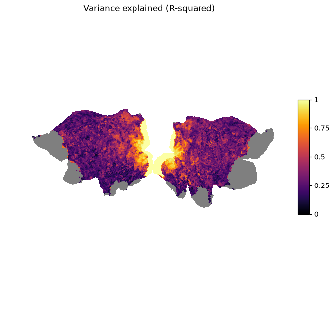
We can see that the vertices with the highest scores are located in the visual areas of both hemispheres. This means that there is high connectivity between higher areas in the visual pathway and V1.
Analyzing the CF results
To analyze and interpret the CF parameters, we will zoom in on vertices with R-squared > 0.6 which is roughly 10% of the vertices in the brain (note that this threshold is somewhat arbitrary).
# Create mask for vertices above R-squared threshold
is_above_threshold = r_squared > 0.6

# Compute proportion of vertices above threshold
is_above_threshold.mean()
0.1059614685568884
We look at the CF size (in mm) indicated by sigma and plot it on the surface.
# Allocate size vector for the entire surface
size = np.full((response_psc.shape[0],), fill_value=np.nan)

# Fill valid vertices with estimated size parameters
size[response_is_valid] = np.where(is_above_threshold, ls_params["sigma"], np.nan)

plot_surf_stat_map_helper(size, vmin=0.0, vmax=20.0, title="CF size (sigma, in mm)");
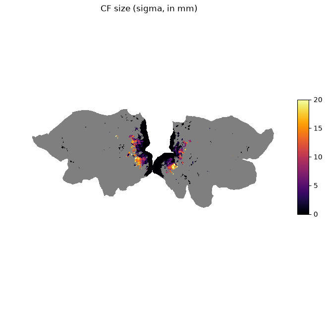
We can see that vertices in higher areas in the visual pathway have larger CF sizes.
Conclusion
This example showed how to fit a Gaussian CF model to empirical fMRI data collected from an experiment in the visual domain. First, we plotted the raw BOLD response data on the cortical surface. Second, we calculated a distance matrix from a white matter surface using Dijkstra’s algorithm. Then, we defined a CF model and optimized its parameters using a grid search followed by least-squares to adjust for baseline and amplitude differences. Finally, we visualized model fit, the estimated parameters, and derived measures on the cortical surface.
Next steps
The predictions by our CF model can potentially be improved. We suggest different directions for improving the pRF model fit:
Increasing the number of points in the parameter grid for the grid search
Finetuning
sigmawith stochastic gradient descent withprfmodel.fitters.sgd.SGDFitterApplying preprocessing steps before fitting the pRF model (e.g., high-pass filtering)
Building a more complex CF model (e.g., difference of Gaussian, see Zuiderbaan et al., 2012)
Stay Tuned
More tutorials on fitting models to empirical data and creating custom models are in the making.
For questions and issues, please make an issue on GitHub or contact Malte Lüken (m.luken@esciencecenter.nl).
References
Glasser, M. F., Coalson, T. S., Robinson, E. C., Hacker, C. D., Harwell, J., Yacoub, E., Ugurbil, K., Andersson, J., Beckmann, C. F., Jenkinson, M., Smith, S. M., & Van Essen, D. C. (2016). A multi-modal parcellation of human cerebral cortex. Nature, 536(7615), 171–178. https://doi.org/10.1038/nature18933
Haak, K. V., Winawer, J., Harvey, B. M., Renken, R., Dumoulin, S. O., Wandell, B. A., & Cornelissen, F. W. (2013). Connective field modeling. NeuroImage, 66, 376–384. https://doi.org/10.1016/j.neuroimage.2012.10.037
Van Essen, D. C., Ugurbil, K., Auerbach, E., Barch, D., Behrens, T. E. J., Bucholz, R., Chang, A., Chen, L., Corbetta, M., Curtiss, S. W., Della Penna, S., Feinberg, D., Glasser, M. F., Harel, N., Heath, A. C., Larson-Prior, L., Marcus, D., Michalareas, G., Moeller, S., … WU-Minn HCP Consortium. (2012). The Human Connectome Project: A data acquisition perspective. NeuroImage, 62(4), 2222–2231. https://doi.org/10.1016/j.neuroimage.2012.02.018
Zuiderbaan, W., Harvey, B. M., & Dumoulin, S. O. (2012). Modeling center–surround configurations in population receptive fields using fMRI. Journal of Vision, 12(3), 10. https://doi.org/10.1167/12.3.10